Art also exists in typography and searching for fonts that pair well together is a quest, but once found it is a magnet to the eye. The infusion of serifs with sans serifs is crucial, however not all are destined to blossom. It takes experimentation along with taste to establish a connection, and the result – a contribution to art.
I was first introduced to the big brands of today whilst working in Harrods. From Prada to Gucci, each one had their own unique typography. It was apparent that fonts are instrumental to their success, sending its own message of elegance. I wanted to know how they created these ripples of creativity?
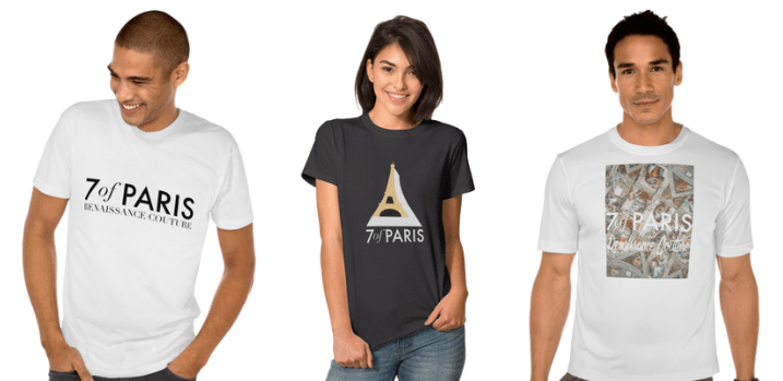
After a year of studying fonts through books, blogs, & articles I began to experiment. The result being 7ofParis.com – positioned in two words “Renaissance Couture” with the aim of selling affordable luxury. However, the challenge I found was using fonts for clients. A perfect example being a construction company. It would not have made sense if its slogan was in fashion typography, so we chose the rather simplistic Helvetica.
To conclude, each font must be in sync with the direction of the business as it is critical in creating your brand image. It can engineer your brand to victory, but only if you know your stuff! That is why, I respect graphic designers. They are truly modern day artists.

Leave a comment